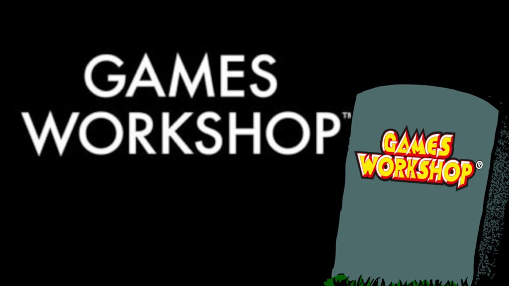
In a completely unimportant and inconsequential business move that affects nobody, Games Workshop has finally started adopting its sleek, modern, new company logo on corporate websites. This elegant and professional block of sans serif capitals makes GW fit for its bright future as a high flying multinational firm, replacing a pokey, old fashioned red-yellow-black wordmark from the 1980s. It’s the natural conclusion of a rebrand that started years ago, intended to make Warhammer the public face, and GW the boring corporate backend. And it’s completely fine, really. I don’t mind at all.
Honestly, it’d be silly to have any kind of emotional reaction to something like a change of corporate logo, exclusively on websites and materials meant for business partners and investors. It doesn’t change any of my favorite Warhammer 40k factions. The lettering on oath parchments hanging off the Primarchs‘ shining warplate has not switched to Arial Bold. A few pixels have changed on the GW jobs website, which I only ever visit to research news stories on Wargamer. It’s fine.

You barely ever see the old GW logo anymore anyway. The company adopted its new, all caps ‘WARHAMMER’ branding in 2019, along with its hybrid, eagle-plus-hammer emblem, pulling Warhammer 40k and Age of Sigmar into one icon. That’s been rolling out across all its retail stores ever since, plastered over peeling shopfronts in local malls that hadn’t been touched since I was at pre-school. The world didn’t end. It’s all fine.

It’s not even like it was the ‘original’ Games Workshop logo, either. By now, we’ve all seen GW’s old photos of opening day at the original store in Hammersmith, London, proudly emblazoned with the name ‘Games Workshop’, nerdily cobbled together from two fantasy-ish typefaces.

We didn’t get the garish, red and yellow one until the 80s – and they were still using it when I turned up to ogle Space Marine Rhino boxes over a decade later. Since then, GW has turned into a $6.9 billion company with hundreds of stores across the globe, and a sparkling reputation as a solid ‘Buy’ for stockmarket investors everywhere.
Such companies do not keep the same kooky, fun logo on their letterheads that they stitched onto red polo shirts 30 years ago. Like the nerds they cater to, they change, grow, mature, and get more boring. Such is the way of the world. I’m a grown-up, I understand these things, it doesn’t affect me. I don’t need my favorite toy company to keep the logo I remember seeing when I was seven. That’s not important. It’s completely all right.

Besides, it’s not like this is news. Sure, the logo on the jobs site and GW’s official LinkedIn appears to have swapped over in the last week. But the new, streamlined, future oriented, mature Games Workshop word mark has actually been clearly out in the open for many months now – in two millimeter high letters, in the legal bumph on the back of every model box. I definitely, 100% noticed it, and it was fine.

Memes I’ve seen spring up about the new logo seem to be latching onto it as a symbol of some more fundamental shift they perceive in GW – from a games company that wants to be funky, niche, and counter cultural to a corporation that wants to be universally palatable and investably bland. That’s patently ridiculous, and never happens, ever. It’s just a logo, it’s not that deep.
If I weren’t such a rational, circumspect, impartial reporter of business realities, blessed with near superhuman levels of big brained, analytical perspective, perhaps I’d shed a tear to witness an obscure artifact of my childhood get filed away in a box, to make way for a cleaner, more boardroom friendly future.

I might start to feel that the pictures and words I saw on shop fronts and model boxes when I was seven are surely the best ones – timeless, ingenious, universal. I might feel a pang of grief that the punchy, punky, black and yellow aesthetics I found painfully cool in 1999 aren’t the same ones kids see today. I might look at GW’s artfully meaningless new corporate logo – designed for a completely different purpose and audience from the classic one that’s seared into my memory – and feel a stab of betrayal, like something I owned had been taken from me.
The logo I remember is gone, and the company, game, and hobby it represented to me when I first saw it are also gone. They’ve grown into something different – which I also like, but isn’t the same. Instead of preserving the exact vibe that it offered seven year old me, at the exact time that I found its products most magical and unique, GW has done what companies do, and changed in order to make more money in more ways.

The picture from the shop I liked has been taken off the shop, stripped of personality, and repurposed to appeal to rich people I don’t know and don’t care about the toys the shop sells. The fact that, in the intervening time, I’ve aged 25 years and begun yearning to be a kid again is just an unrelated coincidence.
If I thought that way, it might hurt my feelings. It might remind me of my mortality, and the impotent anger I feel at the society around me simultaneously getting shitter, and feeling less and less made for me in particular. I wouldn’t like that. I’d probably overreact and immediately connect it with everything else about my favorite hobby that doesn’t look or feel as perfect and enchanting as it did when I bought my first figure (for the same price as a candy bar and in those days it was made of metal). A thing that affects me and my life not a jot, would be making me sad.
Luckily, I’m much smarter than that. It’s just a logo. It doesn’t affect me. It doesn’t matter that it smells of printer paper and carbonated water instead of cheap carpets and polystyrene cement. It’s fine. I’m fine. How are you?
